Blog
Behind the Scenes
Behind the Scenes • Published on September 29, 2022
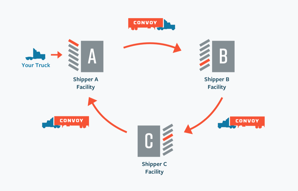
In the traditional model of freight, a truck driver brings a power unit and an empty trailer to a facility, waits for the trailer to be loaded, takes it to another facility, and waits for it to be unloaded. With Convoy Go, a truck driver can arrive at a facility with only a power unit, pick up a pre-loaded trailer, and drop it at another facility without waiting for it to be unloaded. To enable this, Convoy manages a fleet of thousands of trailers (also known as a universal trailer pool) and distributes them across shippers. Shipping with Go has many benefits:
1. Carriers can haul more loads, as the total wait time to pick up and drop off a shipment is cut from 6-8 hours to 15-30 minutes.
2. Shippers have more flexibility on loading and unloading as they’re not dependent on carrier arrival.
3. Greenhouse gas emissions from trucks idling at facilities are significantly reduced.
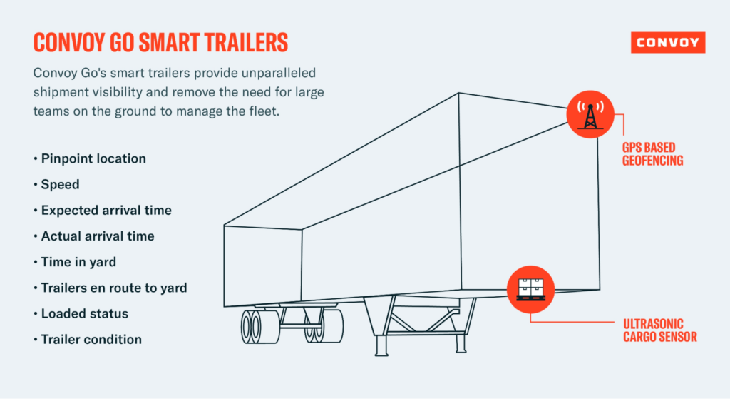
Each trailer has a GPS sensor and cargo sensor. The team I was on within Go (the Fleet Intelligence team) handles ingesting, standardizing, processing, and persisting the data from these sensors to understand things like each trailer’s location, whether they’re moving or idle, and whether they’re carrying a load or not. These sensors enable Convoy to manage its fleet without boots on the ground, and they also bring a unique set of engineering challenges where software bridges into the real world.
Since Convoy manages the entire fleet of trailers, the team internally needs to run highly complex business processes such as repairs (ex. flat tires) and rebalancing (moving trailers from low to high-demand areas). Convoy has a suite of tools to power these processes, all of which are strong at showing a ton of detail about a specific trailer or facility. The problem faced by business teams is none of them provide visualization of trailers and facilities at a fleet-wide level. While Go’s ML models certainly help with forecasting trailer supply and demand between facilities, human intervention is still beneficial because we can quickly discern patterns or respond to last-minute changes and derive actionable insights from visuals.
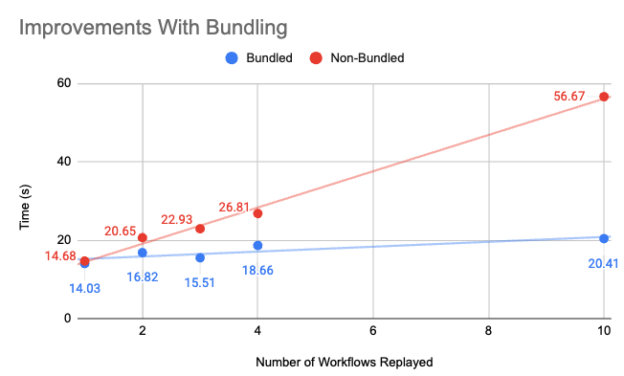
This leads to the project that I built over the summer: a map visualization tool of thousands of trailers and hundreds of facilities in the Go fleet. Users can filter by trailer statuses (ex. active, damaged, idle) and facility characteristics (ex. open 24 hours/day). This project is for use by the 50+ members of fleet management, as well as the broader Go team. Some of the workflows that users can perform are outlined below; previously these would require jumping through many different tools, but now everything has been consolidated into one place.
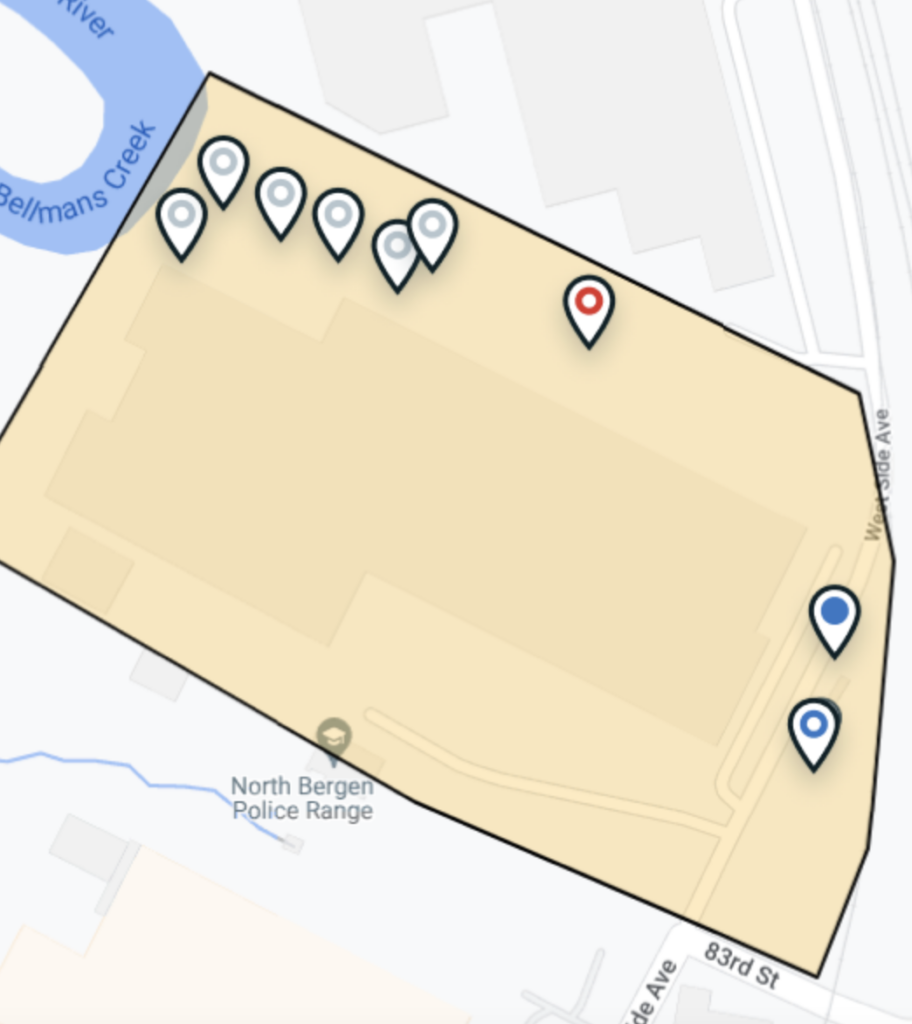
An example of what a trailer and facility might look like is shown above. A key decision that we made in the UI design phase is showing custom pins based on trailers’ statuses. This makes it quicker for users to get insights on each trailer without even having to apply filters. There’s a lot of data stored for each trailer for various use cases, but only three key points are needed to show a custom pin for a trailer: its location, cargo status, and trailer status. There’s also additional business logic to determine the trailer status (ex. idle, active, damaged) as it isn’t something that is simply stored by default. Therefore we implemented a GraphQL resolver that handles filtering through trailers and returning these three points for each one. We chose to handle filtering on the server side and return condensed data structures for each trailer for better webpage performance. We followed a similar implementation pattern for facilities as well.
From the example shown, the user can conclude that this facility has trailers with the following statuses:
• Six idle and empty (grey unfilled circle)
• One damaged and empty (red unfilled circle)
• One active and empty (blue unfilled circle)
• One active and loaded (blue filled circle)
They can now make decisions such as: requesting to move one or multiple of the idle/empty trailers to a facility that needs them or scheduling a repair for the damaged trailer. We recognized that users may not be familiar with these custom pins without using the tool for some time, so we implemented keys on the UI so they can reference the meanings of the colors and shapes.
Another key decision we made was to implement both Filters and View Settings. We wanted to serve many different use cases with this tool without overwhelming the user with the quantity of visible data. We concluded that providing the user with control over what data they want to see (Filters) as well as how they want that data to be represented (View Settings) would help achieve this. Examples of View Settings include a heatmap for trailers and perimeter outlines for facilities. We leveraged the Google Maps API given that these are all different layers of data atop a map.
My favorite aspect of this internship was having ownership over the entire engineering process, from writing a design doc to implementing an MVP and conducting a bug bash for it. This helped make the implementation phase smoother as I had more clarity on what to build. Having a bug bash was particularly helpful as I was able to incorporate initial user feedback into my final deliverable. I also hadn’t done a project with extensive frontend components before, so I picked up a ton of new working knowledge in React and GraphQL. Additionally, from a business perspective, interning on Go was exciting as the team is pushing the boundaries in freight by making drop-and-hook accessible to shippers and carriers of all sizes.
Thanks to my mentor Nguyen Truong, my manager Frances Lucero, the Go product designer Adam Anderson, and the broader Go team for all the help and support throughout the summer!
Grow your skillset in a fast-paced startup environment. Internship applications are open. Learn more about our engineering internships for the 2023 summer.