Blog
Data Science, Industry Insights
Data Science • Published on July 7, 2020
A few months ago, the Web Platform Engineering team partnered with the Design team and started developing Fuel, a new design system that brings together Convoy’s products using the same design language.
Fuel had two objectives:
1) Create a visual and interactive consistency system where our broad spectrum of internal and external products could be unified
2) Redefine the way engineers develop new UI features for our products
We wanted to build a tool where developers could be more agile and build amazing features faster without focusing too much on the little UI details. In this post, I’ll talk from an engineering perspective about the challenges, steps, and learnings the Web Platform Engineering team took to build Fuel.
From the start of the project, we knew what we wanted to achieve with Fuel and had a general idea of what success looked like. It seemed like a very straightforward component CSS project. It’s very tempting to jump right into development when you are given an exciting project like Fuel (and even more so if you are passionate about UI engineering like me), but I’ve seen projects go wrong or be limited in impact because they lacked planning.
What about the developer experience? What were the developers’ current struggles? What technologies were the right ones to use? Should we build it from scratch, revamp our pre-existing library, or use a 3rd party library? What components were we building and in what order?
In short, we had many questions we needed to answer before jumping into any sort of development for Fuel.
We wanted to validate our assumptions on our initial technology choices. One fundamental characteristic we looked for was highly adopted technologies from around the web developer community. Some benefits of these technologies included having reliable documentation, feature improvements, and community collaboration with solid support.
At Convoy, Typescript and React were already heavily used, and we knew developers had a good experience working with these technologies. Having typed components would accelerate their development and help reduce runtime errors in production. We knew that going with a Typed-React component approach would not only be beneficial for everyone but would also reduce the ramp-up time to learn these technologies while adopting Fuel.
Additionally, we needed to figure out the right CSS library for our project. We knew from previous feedback that developers needed a better way to restyle components. A few engineers suggested Emotion styled-components. Thanks to its technology under the hood (like Stylis), its styled-component approach to reusability, and how easy it was to manage styles, we decided Emotion styled-components were the right library to use in Fuel.
With that, we had selected the technologies we wanted to work with. We had the perfect combo, Typed React Styled components!
We decided to select our technology bundle first because we wanted to make sure we focused on our main objective: to improve the developer’s experience. Once we found the technologies that made the most sense for our teams, we had to analyze if we should build it from scratch, revamp our pre-existing component library, or use a 3rd party library and rebrand it.
To figure out the best path, we did an assessment of our effort costs. A summary shown in the table below shows how we split the work that had to be done into two categories:
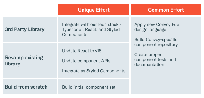
This table helped us visualize what the different scenarios looked like. Building from scratch had the least amount of complexity and technical burden. The other two options had components already built for us, but not with the tech stack we wanted, and would require additional work. On the other side, building from scratch allowed us to have our tech stack built into every layer of Fuel and avoid any hacks and tweaks required for pre-existing components. For us, the best investment was to start Fuel from the ground up.
Now that we knew we were building components from scratch and that we were going to need to develop initial components, we started creating a component roadmap strategy that would allow us to build components in the right order.
We decided to build initial components that had no other component dependencies. For example: Typography, Form Elements, Icons, and Buttons, including a grid system for responsive design. This was the base foundation from which all other components were going to be built.
We prioritized more complex components based on the upcoming features roadmaps for different products.
We now had everything in place and a solid plan. It was time to start our alpha version development. The design team had previously designed the initial components in the Fuel design language, so we had the proper requirements on how components should look and behave.
Throughout the building phase, both Design and Web Platform teams met constantly and consulted product teams about scenarios and perspectives on how components were going to be used.
We wanted our platform to speak for itself and have people adopt it naturally versus having any sort of forced top-down mandate to migrate from management. For Fuel, adoption happened a little after we hit our three-month mark of starting development. We wanted to hold off sharing Fuel until we had enough basic components where teams could start building important elements for their web apps and experience a little taste of the Fuel experience; think of it as the MVP.
We decided to have the MVP ready for our yearly hackathon week, “Moonshot”. As it was coming up soon, we thought it would be a great way to test our first version. We worked hard during the upcoming weeks to get Fuel ready to be tested during our company hackathon. This opportunity would also allow us to validate our goal of improving both developer velocity and experience. We knew getting feedback early and often from our initial adopters would put us in a great position to succeed later.
A handful of teams decided to start their projects with Fuel during that week. These teams provided very useful feedback on the components, design, and our documentation examples. Early adoption allowed us to make sure the direction and development expectations for Fuel were aligned with what we wanted to deliver to our developers.
There were two very important key factors that helped boost Fuel’s adoption: People and Communication.
People knew about Fuel and its goals thanks to the conversations we had with different teams during the building phase. Designers took the task of creating new features using the Fuel design language which helped push engineers to adopt Fuel into their products.
Communication and transparency kept everyone aligned and updated. By utilizing a common Fuel Slack channel, designers and engineers could post questions, ideas, and feedback. Everyone could chime in and give their opinions. By having transparency on what was going on, the patterns we were following, and when bug fixes were being delivered, the community understood where we were taking Fuel.
Our community quickly evolved at Convoy, engineers loved the new design language, the smoothness of the UI and how easy it was to work with it. Developers from even more teams started to contribute to Fuel making it bigger and better.
After 10 months of development, Fuel is now finalizing its beta phase. It has been adopted by multiple products while continuing to grow the number of useful components it has. Having Fuel as a common foundation has made it even easier to start sharing components across products. And thanks to the engagement of all designers and engineers who have contributed and provided great feedback, we are just weeks away from a Fuel v1.0 release.
Here are a few other learnings to consider when designing and developing a component library:
Never forget your customer — Different people with different needs will consume your product. Don’t make assumptions. Consider talking to your customers on how they are going to use your product. Keep things flexible enough for others to make adjustments or get creative with your components.
Always have the KISS principle in mind — Don’t over complicate things. Components are easier to use and test when an expected I/O exists. Keep It Stupid Simple.
Keep it consistent — Props and behavior should be consistent throughout the library. Developers will tend to use one component similar to other ones, so keeping a consistent behavior for things like animations, transitions, and hotkeys with a similar API structure and using common naming conventions is very important.
— For example, if you use the Esc key to dismiss, make sure to allow this on all other components that have a similar behavior.
Scale components properly — When developing your initial components, make sure to leave any logic based on props to a more complex component. This means if you need to handle different behaviors based on props values, you might try rethinking your component. It could be tempting to make components behave differently in different scenarios, but leave that layer to more complex components. Make your foundation as logicless as possible.
Hackathons are a great place to test —
There are some key benefits of having a design system being adopted throughout a company. It enables a more successful cross-collaboration strategy between team members and products. It also allows engineers to easily switch between projects and cross-train team members, reducing the ramp-up burden.
Overall, Fuel has delivered great improvements not only for customers but for our developers as well. Having pre-built and extendable components that just work out of the box has allowed developers to easily connect logic to the UI, build features faster, and ship impactful improvements to our customers quicker. From an engineering standpoint, this project was a great opportunity to take two steps back and rethink our components and patterns.
While we made choices based on what was best for our teams and our developer experience, there are other options that might be better for other teams and companies. My advice is to be thorough, make your assessments properly, provide value, and work to get your teams fully on board. I hope this story provides you with a few insights and helps your team’s decisions.